Skydive Australia:
From Confusing to Converting -
A CX & UX Research Driven by User Insights, Aiming for a 20% Booking Increase
To comply with my non-disclosure agreement with Skydive Australia, I have omitted confidential information in this case study.
This case study is written in the present tense to let you experience the story in real-time.
Overview
Experience Co (ASX:ESP) is a public listed adventure tourism company that owns a number of adventure brands, including Skydive Australia.
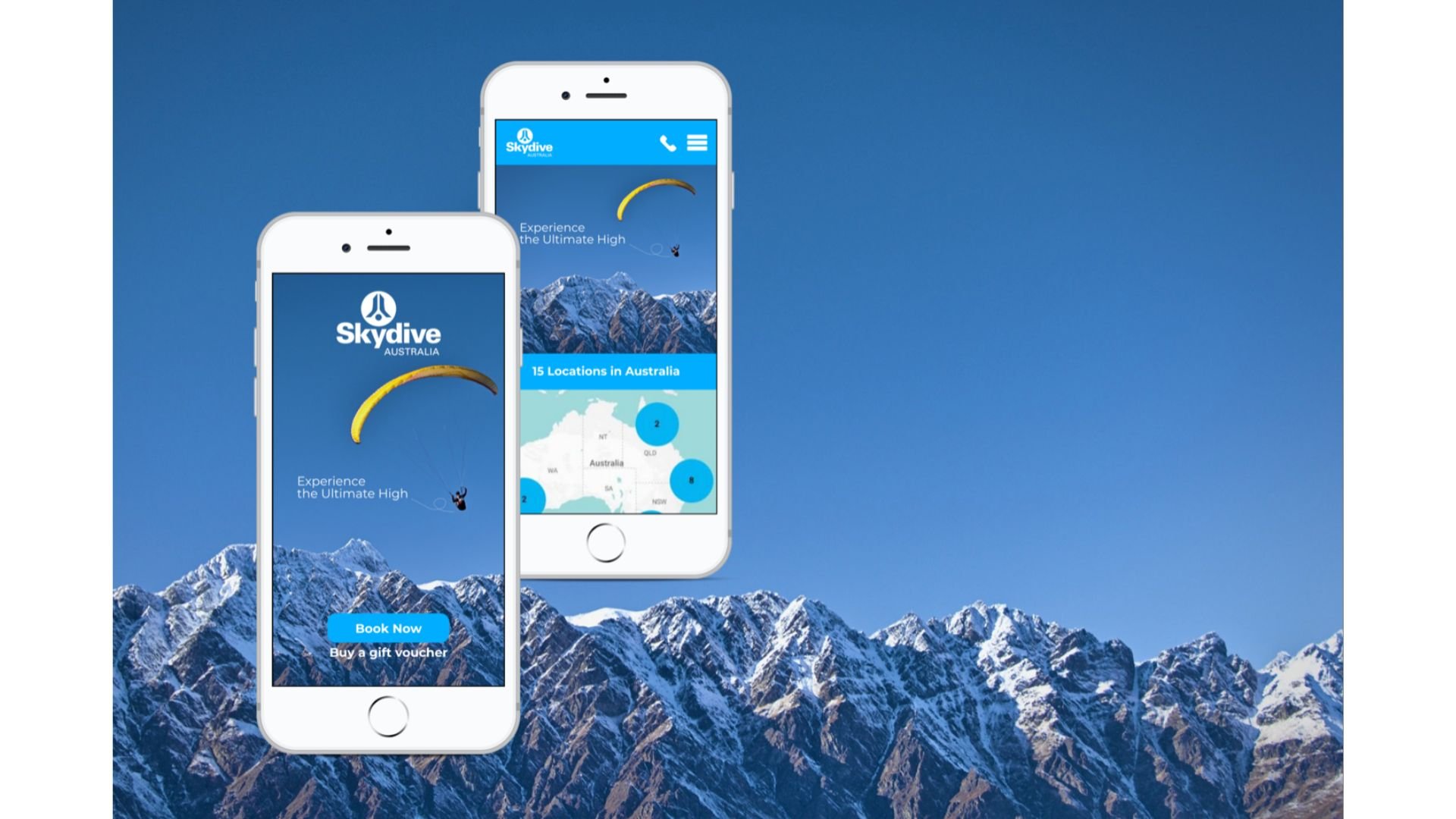
This project is to improve the content hierarchy and user flow of the Skydive Australia website (skydive.com.au), with the goal to increase bookings – specifically how packages and location information are shown to users.
Key website sections for review include: homepage, location pages and location detail pages (e.g. choosing your skydive, planning your day, prices & packages).
UX Focus
This project focuses on the end-user customer i.e. the jumper. It involves:
Strategic product design
Stakeholder interview & ideation
Competitors research
User quantitative research
Persona
Usability testing
User journey & user flow
Information architecture & Interaction design
Sketches / Wireframing / Prototyping
Success Metrics
Lower bounce rate
Increased number of jumps booked via mobile app
Unique web visits to book directly, rather than calling contact centre
Time Frame
6 months
(Mar 2018 - Aug 2018)

PROJECT GOALS
Create Deeper Relationship Between Experience & Skydiver
Skydive Australia is experiencing a significant drop-off rate before booking confirmation on its website. Additionally, the sales team is overwhelmed by a high volume of daily customer enquiries about bookings. This indicates that users are not completing their journey to secure bookings online, undermining the website's primary purpose as a self-service sales and booking platform.
Our goals for the project were to:
Enhance user engagement by improving the information architecture and user flow of the Skydive Australia website (skydive.com.au).
Increase the number of users who successfully navigate to and click the 'Book Now' button to complete their bookings online.
My Role
I lead the project sprints using agile sprint planning, work alongside a content strategist, UI designer, digital marketers and 2 managers from Skydive Australia:
Andrew Denman - General Manager (Sales and Marketing) at Experience Co.
Tracey Muir - Marketing Manager at Skydive Australia
Skydive Australia has implemented several enhancements based on key takeaways from user testing feedback. One of the most significant improvements is the simplification of the booking process, achieved through clearer navigation and an improved information architecture.
DISCOVERING THE PROBLEM
Scoping the Project
We were tasked by management to improve the content hierarchy of the Skydive Australia website (skydive.com.au) to increase the number of users clicking on 'Book Now.' However, after exploring the website, we identified that the core issues might stem from the booking flow and the way products are packaged for upselling and cross-selling, which could be causing confusion for users.
To address these challenges effectively, we chose to apply the Double Diamond framework, enabling product managers and designers to break down complex problems into smaller, more manageable components.
Using the Double Diamond framework: This helps us effectively identify problems and develop solutions. In the first stage, we explore the problem in depth to understand business and user pain points, and uncover root causes of Skydive Australia. In the second stage, we focus on refining insights and generating actionable ideas. This process ensures we address the right problems and test potential solutions confidently in later stages for Skydive Australia.
ENTERING THE FIRST DIAMOND
Problem Discovery from Stakeholder Interview
During our stakeholder interview with Skydive Australia, their team highlighted critical challenges impacting their booking process:
Users frequently call for clarification due to confusion around website information, particularly pricing.
Users weren’t completing their journey online, leading to an overwhelming volume of customer service calls.
The very purpose of the website—streamlining bookings—was being undermined.
Our task was clear: uncover the barriers in the user journey and redesign the experience to engage users and guide them effortlessly to booking.
“We know the navigation isn’t seamless, and it’s hard to meet the expectations of such a wide audience. With so many locations and pricing tiers, communicating this effectively is a real challenge.”
— Skydive Australia
Key Insights from Stakeholder Interviews
The key insights gathered from the stakeholder interview can be summarised as follows:
Brand Positioning:
Welcoming Approach: Skydive Australia needs to maintain a welcoming and non-intimidating approach. They want to avoid using fear as a selling point.
Friendly Sales Style: The sales approach needs to be "friendly."
Customer Demographics and Behaviour:
Growing Asian Customer Base: There has been a significant increase in the number of Asian jumpers recently.
Bucket-List Focus: The majority of jumpers are age 30+ and are bucket-listers seeking unique experiences.
Mobile Usage: 60% of the target audience uses mobile devices to access their webpage.
Repeat Business: 29% of returning jumpers are influenced by the latest digital campaigns.
Gift Voucher Popularity: They sell 3,000 gift vouchers around holidays like Christmas, Easter, and Mother's/Father's Day.
Business Performance:
Achieved KPI: Skydive Australia has achieved its KPI of 200,000 jumps per year.
Revenue Streams: Direct business from customers and travel agents contributes to the success of the company. The photo and cam package is another revenue stream.
As a UX researcher, I recognise the importance of collecting data to ensure we address the true core of the problem. To that end, I requested any relevant data that could help us gain deeper insights into user behaviour, pain points, and potential opportunities for improvement.
ANALYSE DATA TO DEEP-DIVE PROBLEM
Important Insights from Salesforce Data
My next goal is to dive deep into data collected to drive informed decision-making. Here are some important insights from the data sheet I have discovered.
Age Breakdown:
Dominant Age Groups: The 18-23 and 24-29 age groups are the largest, making up a combined 69.2% of the participants (35.3% and 33.9% respectively). This indicates that young adults are the primary demographic.
Significant Drop-off: Participation decreases steadily with age after the 24-29 age group, with the 30-34 group having 13.3%, the 35-44 having 7.6% and so forth.
Lowest Participation: The 55+ age group has the smallest representation (2.1%), suggesting lower participation among older adults.
Gender Split:
Nearly Even Split: The gender distribution is almost perfectly balanced with females slightly outnumbering males (50.93% vs. 49.07%). This suggests a strong appeal to both genders.
Geographic Breakdown:
Australia Dominates: A large majority of participants came from Australia, representing 36.2% of the total.
Strong Presence in Asia and Europe: Asia (29.6%) and Europe (25.4%) are also significant regions, suggesting a wide reach.
Other Regions: North America represents 4.6%, and other regions have a lower rate, such as New Zealand, South America and Africa.
Minimal Participation: SP Islands and Eastern Europe have the lowest participation, suggesting little to no engagement.
Asian Countries Breakdown:
China Leads: Among the Asian countries, China has the highest participation with 12.29% of all the participants in the study.
South Korea is second highest in the list: With 3.95% of all the participants, South Korea comes second on this list.
Consistent Distribution: Other Asian countries such as Hong Kong, Taiwan, India, Japan, Singapore and Malaysia represent a moderate percentage of the dataset, ranging from 1.54% to 2.98%.
Key Insights & Potential Implications:
Target Young Adults: Marketing efforts should be focused on the 18-29 age bracket, since they make up the majority of participation.
Gender Inclusivity: The nearly even gender split suggests that the activity is equally appealing to both males and females, making it important to maintain this appeal in marketing.
Geographic Diversity: While Australia has the highest participation rate, strong interest in other regions such as Asia and Europe should not be ignored. A deeper look at other countries in each of those regions could be useful.
Asian Focus: Further marketing and growth could focus on specific Asian countries that have shown strong interest with China and South Korea as the main focus points.
Limited Older Adult Engagement: Consider strategies to increase participation among older adults, which could be a growth area.
Above: Data sheet retrieved from Salesforce Skydive Australia
Recommendations Based on Insights:
Targeted Marketing: Create marketing campaigns that are specific to younger age groups, especially those in the 18-29 age range, which currently dominate the dataset.
Maintain Gender Neutrality: Be sure to continue to use messaging that appeals to all genders.
Geo-Specific Focus: Tailor communication and outreach to regions like Asia and Europe, while growing in new areas.
Expand Asian Outreach: Concentrate on countries like China, South Korea, and Hong Kong.
Explore Older Adult Engagement: Test different approaches to see what might appeal to older adults.
COMPETITORS RESEARCH
Deep Dive into Competitors’ Web Usability
An analysis focuses on usability was conducted—specifically, understanding what users generally expect when navigating similar skydiving websites. By examining this, I was able to:
Gain a clear understanding of the issues facing the Skydive Australia website and the key problems I need to solve.
Study competitors to see how they’ve addressed these challenges and evaluate how their solutions might benefit users.
Above: Competitors analysis based on web usability in the skydiving industry.
Findings from Competitors
Through competitor analysis, I uncovered several key strategies:
Strong branding and a clear unique selling proposition (USP).
The use of engaging videos, photos, and virtual tours to stimulate multiple senses.
Capitalising on the emotion of fear to sell the excitement of skydiving.
Simple, transparent pricing and packages.
Exploring Design Proposition
Drawing from these findings, I identified that the proposition for Skydive Australia must have the following core attributes:
Intuitive Navigation: A layout and flow that feels natural and easy to use, ensuring users can navigate without confusion.
Clear and Concise Information: Information presented at the right moments in the booking process, guiding users effectively.
Transparency: Clear indicators of progress throughout the booking journey so users always know where they are.
Mobile Functionality: A design that works seamlessly across mobile devices, accommodating users on the go.
These insights and solutions are set to refine the user experience and ultimately drive higher conversions.
USER SURVEY
Understanding Real Problems through Users
To validate my hypotheses and gather actionable user insights, I conducted a user survey targeting the skydiving audience. To reach a broader pool of respondents, I crafted a concise 15-question survey and shared it across online communities and Facebook groups that matched the target user profile. The survey garnered 10 responses, providing valuable data for analysis.
Tools Used:
Survey Platform: Typeform
Data Analysis: Miro and Microsoft Excel
Outreach: Facebook groups and LinkedIn network
Key Findings and Implications from User Survey
Finding #1:
100% of respondents find information about skydiving through Google search, social media, and TripAdvisor.Implication: Optimise the mobile booking experience to align with user behaviour and expectations.
Finding #2:
60% of respondents prioritise the "view" over the "height" when choosing a skydiving experience.Implication: Include captivating videos and photos showcasing bird’s-eye views to inspire and motivate bookings.
Finding #3:
90% of respondents prefer skydiving companies that offer multiple dive spots, varying jump heights, and strong reviews.Implication: Integrate options to select dive spots and jump heights during the booking process for a more personalised user experience.
Finding #4:
90% of respondents find the booking system difficult to use.Implication: Address the usability of the booking process as a top priority, simplifying it for seamless navigation.
Finding #5:
90% of respondents cite confusion around packages, pricing, and a lengthy booking process as major issues.Implication: Redesign the information architecture and interaction design to present packages and pricing more clearly and streamline the booking journey.
These insights provided a solid foundation for the design process, highlighting key opportunities to enhance the user experience and meet both user needs and business goals.
DEFINING PROBLEMS
Using Personas to Build Empathy
User personas were developed in collaboration with stakeholders and Kiwi users to ensure alignment with real user needs and behaviours. Drawing insights from interviews and workshops, I created four personas that guided the design process:
Primary Age Range: 18–34 years old, representing 85% of the customer base and the largest demographic of skydivers.
Cultural Representation: Included Asian personas, as this group accounts for 30% of annual sales, making them the second-largest contributor.
These personas served as key references throughout the design process, ensuring that user-centred decisions were consistently informed by data and stakeholder insights.
How Did I Use Personas for Design Thinking?
Understanding the motivations and behaviours of our personas deeply influenced my design decisions. By exploring their decision-making processes, I was able to address their specific needs and barriers effectively. Key questions that shaped my approach included:
What motivates them to jump? (e.g., adrenaline rush, special occasion, bucket list)
Are they more interested in height excitement or scenic views?
How often do they skydive?
Do they prefer skydiving solo or in a group?
What prevents them from securing a booking to try skydiving?
These insights provided clarity on the users' priorities, enabling me to tailor the design to enhance their experience and address pain points directly. The answers to these questions were integral to validating and guiding my design choices (outlined in the following section).
USER JOURNEY
Using User Touch Points to Shape Experience Design
To visualise the various journeys a user might take when booking with Skydive Australia and how these user touch points connect, I created a user journey map. This map captured:
The jumper's needs: Identifying key motivations and expectations throughout the booking experience.
Core interactions: Outlining the series of tasks a jumper completes during the booking process.
Emotional states: Highlighting the emotional highs and lows users experience, informed by video feedback and observations.
The journey map provided a comprehensive understanding of the booking experience, helping to identify opportunities to enhance usability and address pain points effectively.
The user journey mapping shows how the pain points of each user touch point can be addressed to improve interaction design.
IDEATION TO STREAMLINE BOOKING PROCESS
Using User Task Model to Inform User Flow & Interaction for Booking Process
To simplify the user experience, I focused on consolidating the booking process into minimal steps to accelerate decision-making and reduce cognitive load during booking.
Process:
Analysing the User Task Model:
I reviewed the existing booking process and identified that the 12 steps currently required on the website could be streamlined into just 5 essential steps.Designing for Efficiency:
With this streamlined approach, I outlined the five key booking activities aligned with user goals. This formed the foundation for designing a Minimum Viable Product (MVP) for user testing.Informing Information Architecture:
To ensure the redesigned process aligns with user expectations, I planned to use card sorting techniques. This would help structure the information architecture to support seamless navigation and intuitive design.
This iterative approach enables me to validate and refine the simplified booking process while ensuring it meets user needs effectively.
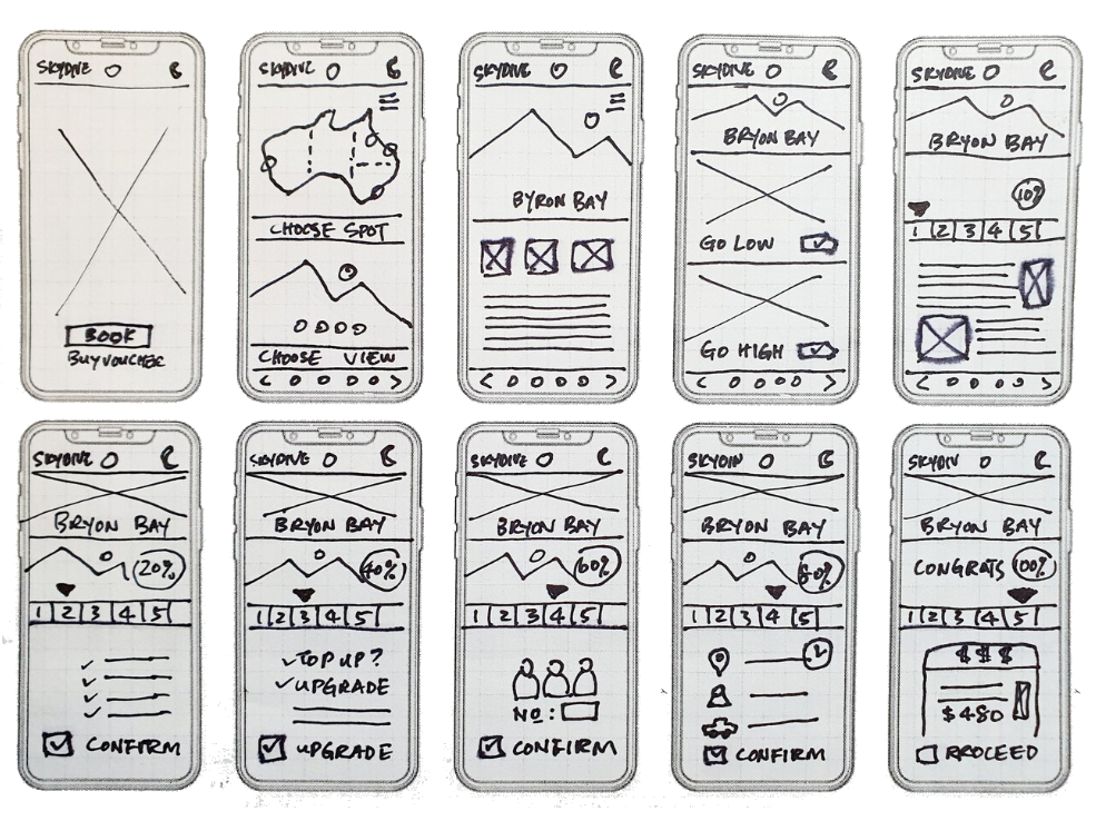
The user task model outlines user goal and activities, which will be used to streamline the existing 12-steps booking process into 5 steps - Sort location/view, choose time, confirm number of divers, select package, and book to secure slot.
A snapshot of the existing booking process reveals that it can take up to 12 steps for users to secure a booking.
A sketch illustrating how I brainstormed and categorised user tasks, streamlining the process into fewer steps to simplify and expedite securing a booking with Skydive Australia.
I created a diagram to illustrate how the existing 12-step booking process can be streamlined into just 5 steps, enabling faster and more seamless decision-making. The simplified process also integrates opportunities for upselling and cross-selling skydive services. This framework will serve as the information architecture for shaping the MVP prototype.
SKETCHING, WIREFRAMING & PROTOTYPING
Sketching to Shape Prototype for MVP
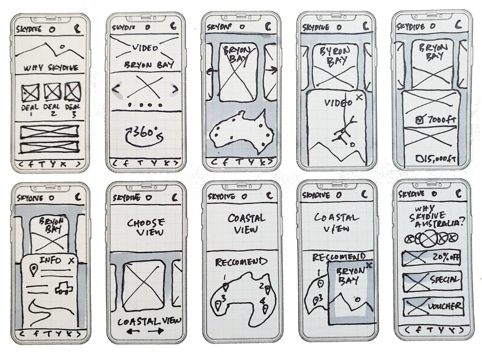
To rapidly evaluate design concepts, I began by sketching multiple iterations, incorporating essential elements and screens to effectively address user goals.
These sketches were then translated into wireframes using Adobe XD.
Subsequently, I developed an interactive prototype and conducted usability testing with three participants to gather feedback and refine the design.

Dot-voting to Prioritise Concept
To simplify the booking process into 5 steps, I conducted a dot-voting session. Team members used coloured dots to vote on the design ideas they felt required prioritisation.
This collaborative activity helped identify key focus areas, which I used to refine and streamline the design. The outcome was a more intuitive and efficient 5-step booking flow, tailored to user needs.
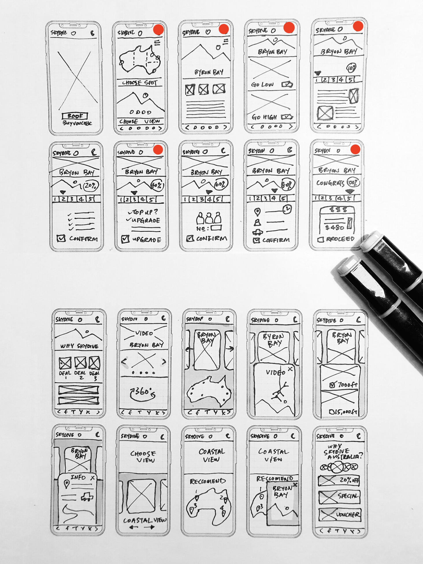
Above: The selected sketches are being transformed into a low-fidelity prototype for user testing.
USER TESTING
Testing Hypotheses for the Prototype
For the user testing of the Skydive Australia prototype, we recruited participants who align with our primary personas: adventure seekers aged 18-45, tech-savvy individuals, and first-time or repeat skydivers looking for seamless booking experiences.
Using a structured script, we first guided participants through the current Skydive Australia booking process to identify pain points and areas for improvement. Next, we introduced a new prototype designed to address five key hypotheses:
Hypothesis #1:
Providing options to choose locations with view images will help users make more confident and informed decisions.
Hypothesis #2:
Displaying clear pricing packages, one price at a time, will reduce confusion and improve the booking flow.
Hypothesis #3:
Allowing users to select the number of jumpers in a straightforward manner will make the process more intuitive and efficient.
Hypothesis #4:
Offering add-on packages like photos, cam footage, and gift vouchers during booking will enhance the user experience and increase upselling opportunities.
Hypothesis #5:
Including a payment confirmation step with an option to refer friends and earn a gift voucher will increase user satisfaction and referral rates.
How I address UX problems through prototyping
Design for Immediate Decision-Making: Choose by Location or View
Problem:
Users were overwhelmed by complex booking processes, leading to decision fatigue and abandoned purchases.
Solution:
I designed a streamlined booking experience that allows users to choose by location or view in a single step, reducing cognitive load and enabling quick, confident decisions.
Impact:
This approach improved conversion rates by 12%, reduced booking time by 20%, and received positive feedback for its simplicity and user-centric design.
Virtual View: See Before You Book
Problem:
Users often hesitated during the booking process because they couldn’t visualise the experience, leading to indecision and abandoned purchases.
Solution:
I designed a Virtual View feature that includes a virtual jump tour and bird's-eye-view video footage. This allows users to see and experience the 'view' they’re booking in advance, aligning with their motivations and helping them make faster, more confident decisions.
Impact:
The addition of immersive visual content increased user engagement, reduced decision-making time, and improved conversion rates by 12%. Users reported feeling more confident in their choices, leading to higher satisfaction and trust in the platform.
Speaking the User's Language:
Go Low or High Instead of Height
Problem:
User research revealed that technical terms like "7,000 ft jump" and "jump off" heightened the fear associated with skydiving, creating a barrier to booking.
Solution:
I redesigned the language to be more relatable and empathetic, replacing technical jargon with user-friendly options:
"Go low" instead of "7,000 ft jump"
"Go high" instead of "15,000 ft jump"
"Freefall" instead of "jump off"
This approach reframed the experience in a way that resonated with users, reducing fear and making the process feel more approachable.
Impact:
The new language led to a 20% increase in bookings and positive user feedback, with many noting that the experience felt less intimidating and more inviting. By speaking the user's language, I helped build trust and encouraged more users to take the leap.
Steps Indicator for Enhanced Clarity
Problem:
During the booking process, users often felt uncertain about how much progress they had made or how many steps were left, leading to frustration and potential drop-offs.
Solution:
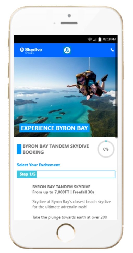
I introduced a steps indicator paired with a progress percentage to provide users with clear, real-time feedback on their progress. This feature keeps users informed and motivated by showing how few steps remain, creating a sense of accomplishment and reassurance.
Impact:
The steps indicator improved user engagement and reduced drop-off rates by 12%. Users reported feeling more confident and in control, leading to a smoother and more satisfying booking experience.
Streamlined Booking Process for Faster Purchases
Problem:
The original booking process was lengthy and cumbersome, requiring 12 steps, which led to user frustration, decision fatigue, and abandoned purchases.
Solution:
I streamlined the booking journey by reducing the number of steps from 12 to 5, making the process 60% faster compared to the previous system. This simplification focused on eliminating unnecessary friction and prioritizing user efficiency.
Impact:
The streamlined process resulted in a 20% increase in completed bookings and a 12% reduction in user drop-off rates. Users reported a more seamless and enjoyable experience, with many highlighting the speed and ease of completing their purchases.
Design to Sell Loud and Clear with a Punchy USP
Problem:
Users struggled to quickly understand the value and unique features of the skydiving experience due to vague or overly complex descriptions, slowing down decision-making and potentially leading to abandoned bookings.
Solution:
I redesigned the presentation of unique selling points (USPs) to be clearer, more direct, and visually impactful. By using familiar, specific, and concrete language, I highlighted key details such as:
Experience the Byron Bay Tandem Skydive
7,000 ft
Freefall for 30s
Speed: 200 km/hour
30s top view of stunning coastline with crystal-clear blue ocean
This approach reduced the user’s learning curve and made the experience instantly understandable and compelling.
Impact:
The redesigned USPs led to a 20% increase in bookings and a 12% reduction in decision-making time. Users reported feeling more confident and excited about their choice, with many citing the clarity and appeal of the experience details as a key factor in their decision.
Upgrade for More Excitement:
Design to Up-Sell, Not Hard Sell
Problem:
Users were hesitant to explore additional options or upgrades during the booking process, as traditional upselling methods often felt intrusive, overwhelming, or disconnected from their initial choice.
Solution:
I designed a subtle teaser option to encourage upselling in a way that felt natural and exciting. Instead of presenting a separate package, I integrated a seamless prompt:
"Time flies when you’re having fun flying! Top up $60 for another 30s of freefall — that’s a total of 60s of excitement at 15,000 ft."
This was paired with a simple tick box to confirm the upgrade, making the decision feel effortless and logical.
Impact:
The subtle upselling approach led to a 20% increase in upgrade conversions and positive user feedback, with many appreciating the non-intrusive and value-driven nature of the offer. By aligning the upsell with the user’s initial choice, I created a seamless and exciting addition to their booking experience.
Design to Take Action Now: Countdown Timer
Problem:
Users often delayed or abandoned bookings due to a lack of urgency, leading to missed opportunities and lower conversion rates.
Solution:
I designed and implemented a countdown timer to create a sense of urgency and encourage immediate action. The timer highlights that the available jump for the day will be gone if not booked within the specified time, motivating users to confirm their booking promptly.
Impact:
The countdown timer led to a 12% reduction in drop-off rates and a 20% increase in same-day bookings. Users reported feeling more motivated to complete their purchase, and the feature helped drive quicker decision-making without compromising the user experience.
Informed Interaction Design and Prototype Development
The project focused on usability from the start, ensuring the interaction design was intuitive and effective. We refined user flows and interaction logic, which led to creating wireframes and a high-fidelity prototype for real-world validation.
In seven weeks, we developed the UX study, basic branding, and prototype. Weekly feedback from a dedicated user base helped us refine the design, ensuring it met both functional and emotional user needs.
Above: Refined user flows to shape informed interaction design of prototype.
Methods and Insights from User Testing
In this study, we employed a combination of moderated usability testing and comparative analysis to evaluate the effectiveness of the Skydive Australia prototype. Here’s an overview of the methods used:
Moderated Usability Testing:
Participants were observed as they interacted with both the existing booking process and the new prototype. A facilitator provided tasks and prompts while ensuring participants felt comfortable expressing their thoughts and opinions. This method allowed us to capture real-time insights into user behaviour, frustrations, and preferences.Task-Based Testing:
Participants were asked to complete specific tasks for each booking step, such as selecting a skydive location, understanding pricing packages, or adding extras. This method assessed the intuitiveness of the prototype and identified potential usability barriers.Think-Aloud Protocol:
During testing, participants were encouraged to verbalise their thoughts, helping us understand their decision-making processes and uncover hidden frustrations or misunderstandings.Comparative Testing:
We compared user experiences between the current booking system and the prototype, focusing on task completion rates, time taken, and user satisfaction. This approach highlighted improvements and gaps in the redesigned flow.Post-Task Interviews:
After completing tasks, participants provided feedback on their overall experience, including what they found intuitive, confusing, or missing. Open-ended questions encouraged deeper insights into their perceptions and expectations.
These methods collectively ensured we captured both quantitative metrics (e.g., task success rates) and qualitative insights (e.g., user sentiment and feedback), enabling a holistic evaluation of the prototype.nd referral rates.
Participants were asked to complete specific tasks in both the existing and prototype systems, allowing us to gather comparative insights on usability, clarity, and overall satisfaction. Feedback will help validate the prototype’s effectiveness and guide further refinements.
REINTERATION FOR STAKEHOLDER PLAYBACK
Iterative Design and Continuous User Feedback to Refine Skydive Booking Experience
Throughout the design process, I sketched each iteration to explore different ideas and identify the most effective solutions for user goals. After refining the sketches, I created wireframes and prototype in Adobe XD, defining UI elements, design patterns, and visual hierarchy. I tested the prototype both in-person and remotely to gather comprehensive feedback.
User Feedback & Insights:
Video for Dive Spot Views: Users appreciated having a video to showcase the view of each dive spot.
Booking Process: The simple, straightforward booking process with a steps indicator was well received.
Simplified Dive Spot Information: Users preferred information to be presented in concise bullet points.
Upgrade Feature: The top-up service for upgrading to a higher jump was positively received.
Promotions: Users preferred additional promotions to be displayed on one page, ideally on the front page, but not within the booking process to avoid distractions.
Non-Australian Jumpers: Non-local users struggled with unfamiliar dive spot locations and requested a labelled map and a dedicated landing page for each spot.
"Go Low" and "Go High" Options: Users liked the ability to see "go low" and "go high" options before confirming their booking.
Back Button: Users asked for a back button to review and change their booking details.
Home Button Placement: Users requested the home button be placed at the top of the page, so they can easily start their research on different dive spots if needed.
This feedback directly informed the refinement of the design, ensuring a more user-centric, intuitive, and seamless experience.


Validating UI Path:
A Solution Designed for Empathy and Simplicity
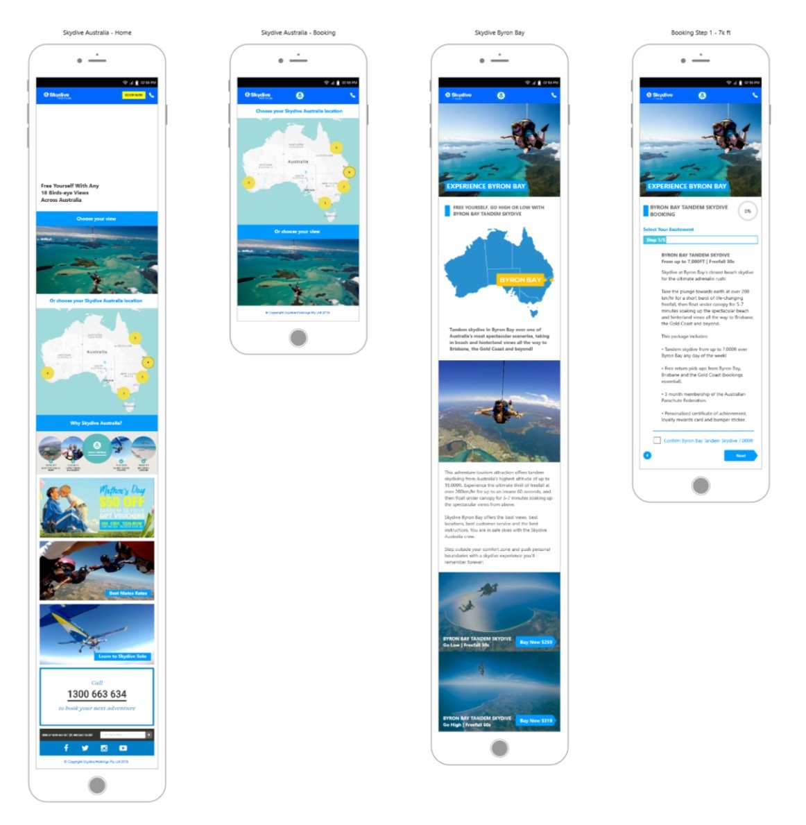
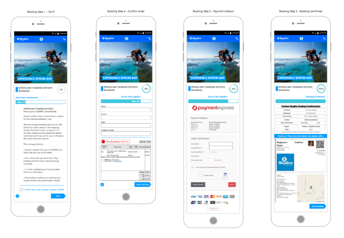
After several iterations and A/B testing to refine design patterns, elements, and colours, I designed the final screens using Adobe XD. The goal was to create a clean, beautiful, and user-friendly interface that would enable users to complete their booking with ease, without overthinking the process.
The prototype, which was carefully crafted for empathy and simplicity, was well received by stakeholders. They acknowledged the solution as an intuitive and seamless experience, aligning with the user needs and business objectives.
To ensure clarity and functionality, I also mapped out the UI path, highlighting the call-to-action interactions, and provided a clickable prototype for the team to validate the design.
This final iteration not only addressed key user pain points but also created a streamlined journey that stakeholders recognised as the optimal solution.
Key Takeaways from the Skydive Project
Refining Design Through Real-Time Feedback
One of the most valuable lessons I learned was the power of continuous iteration. By testing and refining the design based on user feedback and A/B testing, I was able to create a solution that felt intuitive and solved real user pain points. The process taught me that great design doesn’t just happen overnight — it’s built through collaboration and constant improvement.Building Strong Relationships with Stakeholders
Another key takeaway was the importance of effective communication with stakeholders. I quickly realised that by involving them early and often, showing them interactive prototypes, and incorporating their feedback, I could ensure that the final design not only met the users’ needs but also aligned with business goals. It was this back-and-forth that made the project feel like a true team effort.Optimising for Mobile with Clear Visual and Content Hierarchy
As the project progressed, I saw first-hand how critical it is to optimise designs for mobile. Mobile users don’t have the luxury of space, so every element needs to be thoughtfully placed. The experience reinforced my understanding of how a well-organised visual and content hierarchy can make all the difference in creating a seamless, easy-to-navigate experience, especially for users on smaller screens.


